AT&T · Case Study
Setting the first privacy design standard at the company and building a control center for 50+ state laws.
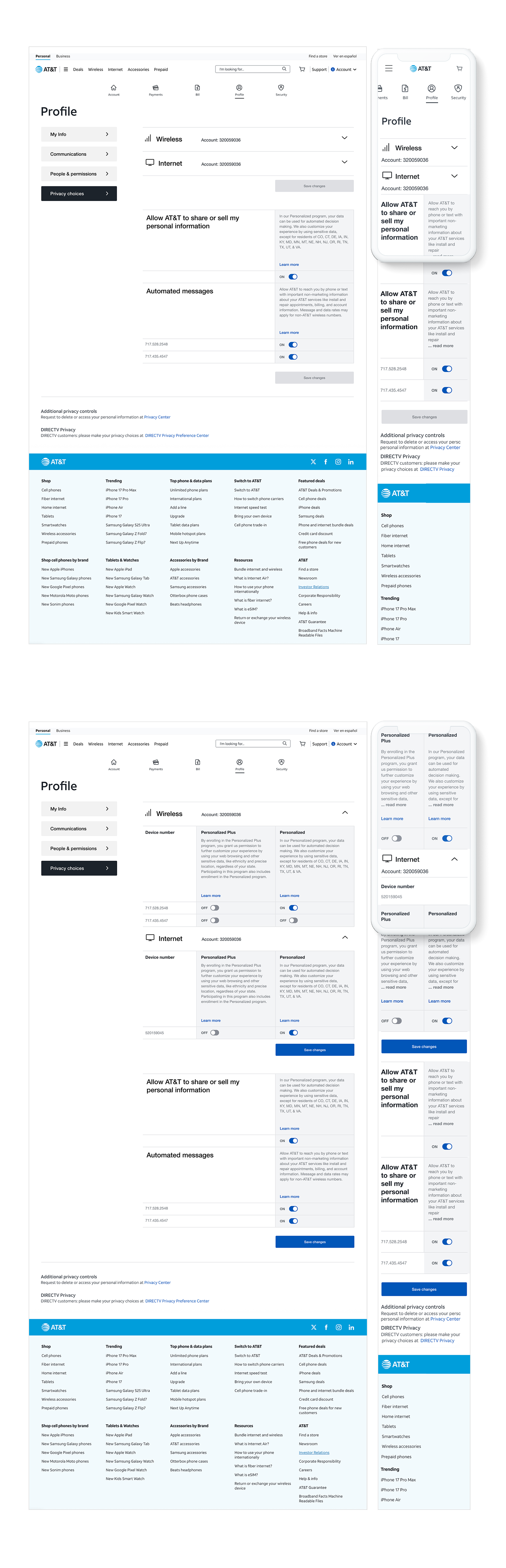
New state privacy laws turned AT&T's scattered privacy controls into a legal risk. I set the first privacy design standard at the company and brought 3 programs into one control center for 100 million customers.
Overview
AT&T’s privacy controls had accumulated across multiple pages with no single place to manage them. Programs were disconnected, consent states were unclear, and customers had no reliable way to understand what they’d agreed to or how their choices connected.
Raising the bar on transparency, sensitive data use, and consumer consent. Regulators were actively scrutinizing dark patterns.
Disconnected controls meant customers could not use their rights. That made it a legal risk as well as a design problem.
Approach
Privacy consent design looks simple until you are inside the actual content.
Legal needed every program fully disclosed, with no choice nudging customers either way. Product needed customers to stay opted in, on a page short enough to use. I set one guideline: no choice can look preferred over another.
Framework
In pharma I had dealt with a similar tension. Regulators accept a required amount of information up front, so not every regulatory detail has to be on the page, as long as the rest is easy to reach. I used that framework to make the case to legal: show customers what they need to decide, and keep the full legal detail one tap away. Each program shows what it does, what data it uses, and the customer’s current consent. Legal got complete disclosure. Product got a page customers could scan in seconds.
Pattern Explorations
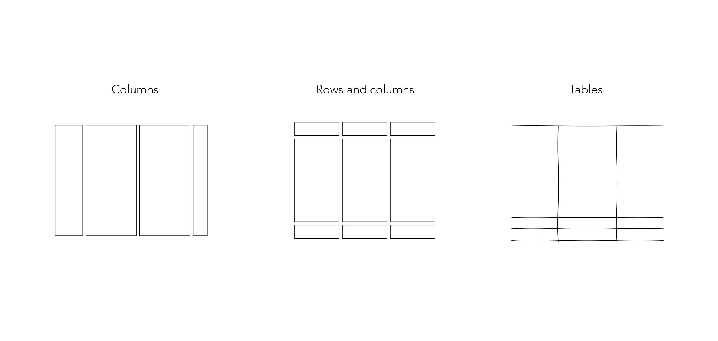
With the rule and the framework set, I designed and tested three layout patterns against both.
Could not handle the volume of legal content required across programs.
Lost the program relationships critical to compliance communication.
Collapsed under consent state complexity at scale.
None of them worked alone. The content needed a hybrid: rows and columns combined into one framework that could hold programs, explanations, and consent states at once without losing readability.
Influence Without Authority
Brought legal into the design work early. Most teams send finished screens to legal for review. I asked legal and compliance to help write the rule instead: no choice can look preferred over another. Once they shaped the standard, reviews moved faster because we were judging every screen against something we had agreed on together.
I used the pharma disclosure model as shared ground. Every program showed the same required information up front, with full legal detail one layer below. Teams stopped debating layouts and started checking their content against the standard.
Built it so the work could continue without me. New state laws were still passing. I documented the rule, the disclosure layers, and the hybrid table pattern so any team could add a new consent program without a redesign. The standard became the internal benchmark for ethical design at AT&T.
Solution
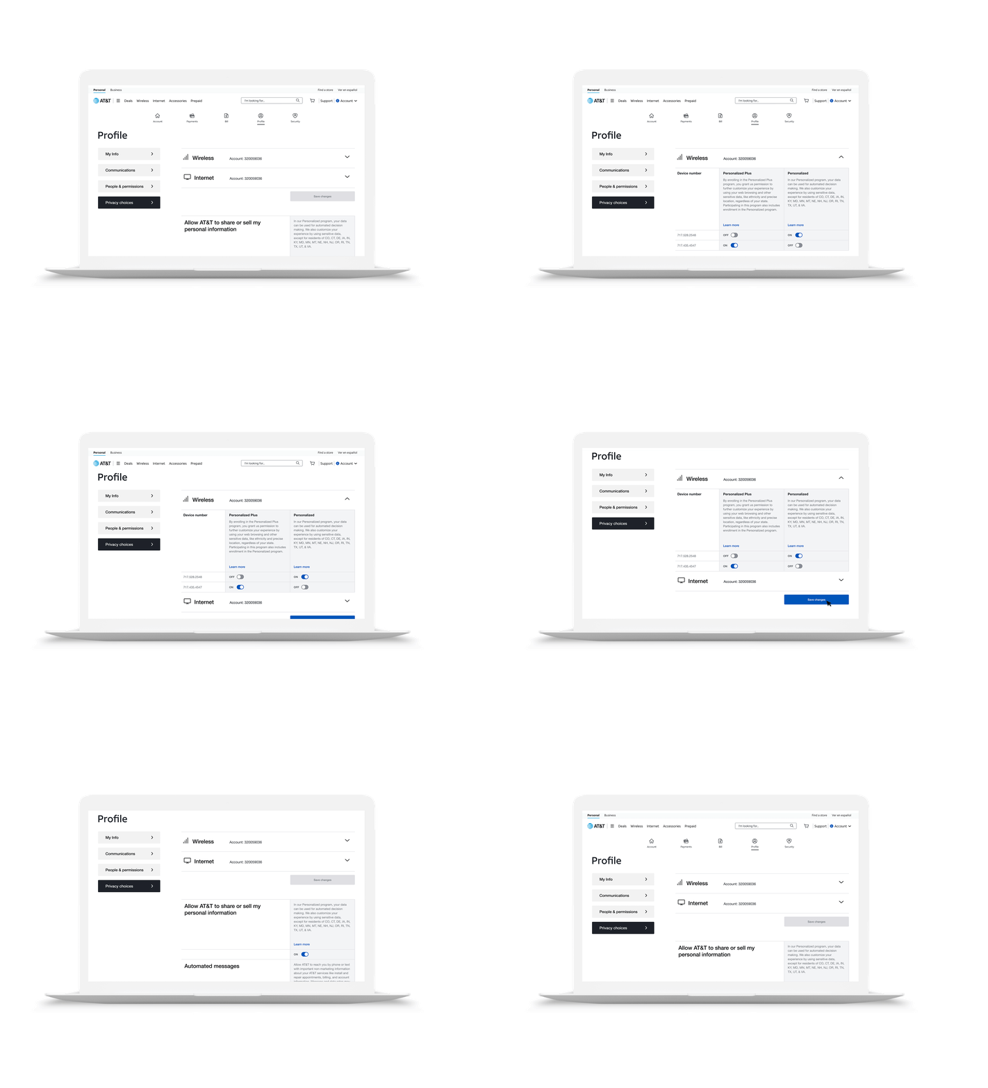
The hybrid table structure did two different jobs depending on the device.
Programs sit side by side. Customers scan across and compare options. Consent states are immediately visible without expanding anything.
The table shifts into stacked modules. Each program becomes a contained section that expands to reveal detail. Same information, different spatial logic, readable at every screen size without a separate mobile design.
I tested the hybrid table with customers on desktop and mobile. Each person had to find a privacy program, understand what they had agreed to, and change a setting. The test also checked the rule: no choice could look preferred over another.
Outcomes
The regulatory environment isn’t settled. New state laws keep passing. New consent programs will need to be added. The framework was designed with that in mind.
All privacy controls in one navigable experience.
Holds program relationships, legal content, and consent states in one structure without losing readability.
Desktop comparison view shifts to mobile stacked modules. Same information, different spatial logic.
Neutral interface that presents choices without steering them. It became the internal benchmark for ethical design.
New consent programs slot into the existing structure as legislation evolves. No redesign required.
A consent system built to absorb new state privacy laws without starting over.
What I Learned
Compliance work moves faster when legal helps write the rule instead of only reviewing the result.