Goosehead · Brand & Digital Design
Restructuring an insurance site around how customers build confidence, raising quote requests 28%.
Goosehead's business model changed and its site had not caught up. I restructured the site around how customers build confidence. Quote requests rose 28%.
Overview
Insurance is a category built on complexity. Policies, pricing structures, and coverage models create decision fatigue before a customer even gets to a quote. Most insurance websites make this worse, burying the value proposition under jargon and forcing users to work for information they should be handed immediately.
Goosehead was rethinking how insurance should work for clients, aiming for a clearer, more transparent experience, giving clients better visibility into services, pricing, and value.
There was a gap between what the business was becoming and what the website was communicating. The digital experience wasn’t reflecting the shift in the model.
Approach
The opportunity was clarity, not simplification for its own sake, but precision about what Goosehead actually does and why it’s different. I partnered with stakeholders, developers, and customers to align on three things before design began.
What the model actually was and how to explain it without industry jargon, legible within the first scroll.
Where users were losing confidence or dropping off, and what was preventing them from moving forward.
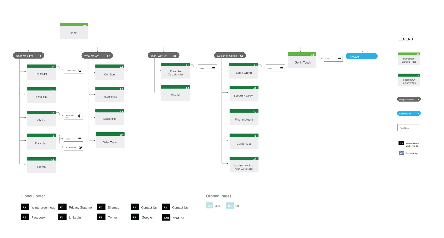
What the information architecture needed to do to close the gap between what users needed to understand and what they were finding.
Design
Insurance sites tend to over explain. I made the call to cut: less copy, fewer features, clearer choices.
Clarified the service model so the value proposition was legible within the first scroll, no hunting required.
Pricing and coverage logic surfaced early and built into the architecture.
Guided decision-making by revealing information at the right moment, rather than presenting everything at once and creating overwhelm.
I ran usability testing on the redesigned site before launch. It scored 85 on the System Usability Scale, well above the industry average of 68.
Outcome
The new site explained Goosehead's model in the first scroll. Quote requests rose 28%.
Quote request rate compared before and after launch.
Architecture restructured around how users build confidence, right information, right order.
Model explained plainly and surfaced immediately, no jargon, no buried feature lists.
Interaction patterns designed for the roadmap, not just the launch, built to absorb future growth.
Closed the gap between the business model and the experience.
What I Learned
I would test the pricing explanation with customers earlier. It was the part that changed most late in the project.